Story behind the Padrino logo
Padrino is a free and open-source web framework, and they were looking for a new logo and image that would match the outstanding quality of this exciting and versatile framework.
The work
My work for Padrino was the creation of the new logo, from the idea and conceptualization to the execution.
The outcome

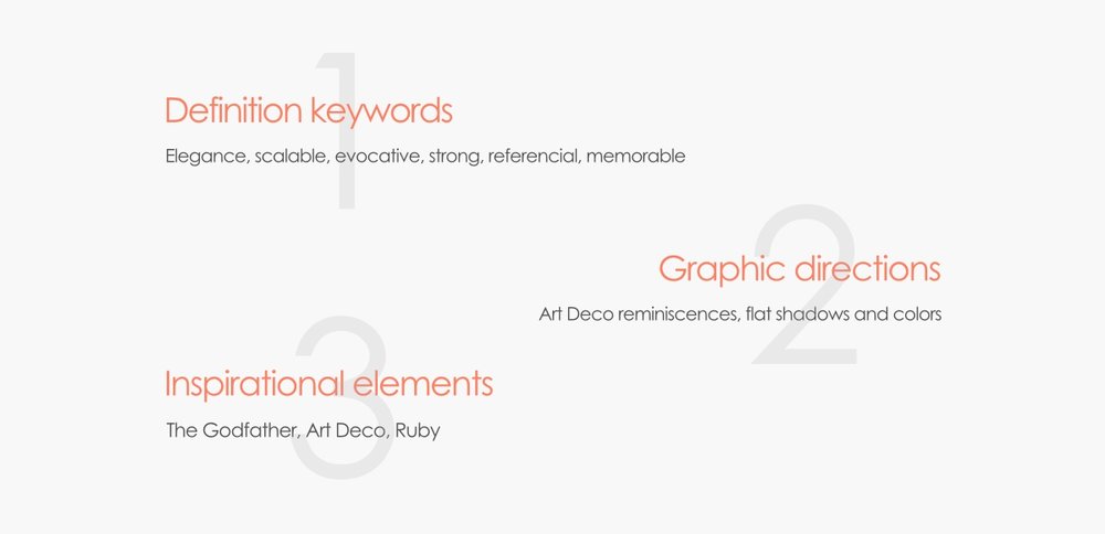
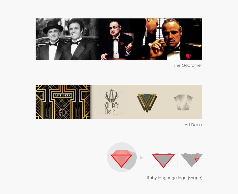
In the conceptualization and execution of the Padrino logo the driving force was primarily "elegance”. Allusion to this concept is made in the definition found in the same Padrino website. Likewise, such reference to the Godfather (Padrino in Italian and Spanish), should also be clear, evoking and with a focus on the positive values (not the negatives :) that have cemented him as one of the most iconic fictional characters of the 20th century.
From that origin point, there were two other main factors that shaped the style and form of this logo. Firstly, you will appreciate the styling features of Art Déco, in allusion to the younger years of Vito Corleone (1920-1940). And second, the relation of Padrino platform with the Ruby language had to be shown in one or other way; the solution was the use of a triangular shape, evoking the shape of a ruby (see below)

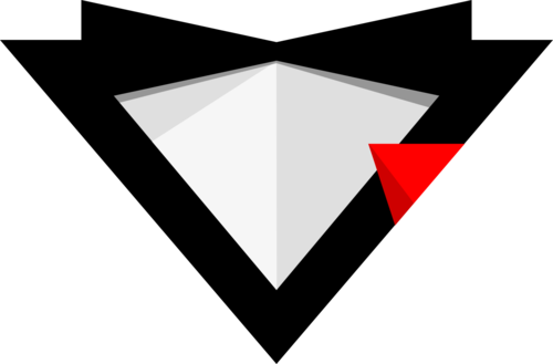
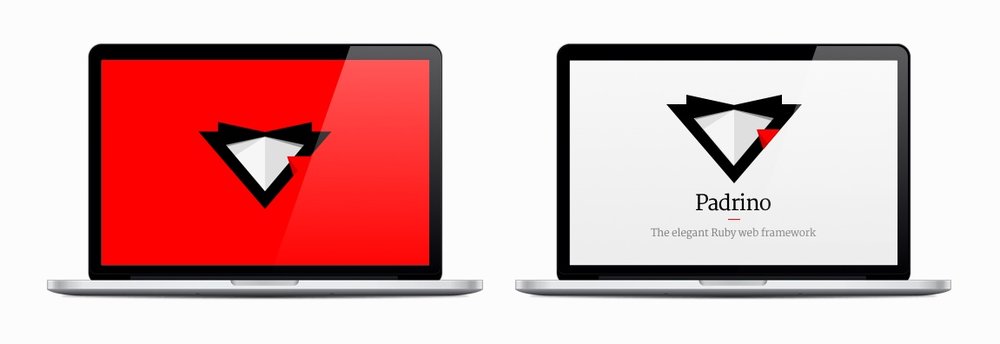
So the outcome is a logo that collects the essence and the spirit of the topic, and represents perfectly the slogan of Padrino: "The Elegant Ruby Web Framework".
 .
.

All credits for this post goes to Daniel Polo.